I flip it closed for the last time, the light in its one visible eye slowly fading as the electrons from its time-worn battery slow to a stop. I lay it to rest in an all-too large casket and place it on a yet unlit pyre, a pile of long-expired electronics tiredly but patiently awaiting the possibility of some future application. The shiny new box stands at odds with the dusty tangle of old ribbon PATA cables, stereo-status-unknown headphone extension leads and dirty great orphaned power supplies (which could totally come in handy one day, dammit). The image on the front of the box, fresh in its youth and immeasurable potential belies the age of the time worn handset within. With a hand over my heart, I hurriedly say farewell to my old and faithful phone. It has finally been overtaken by a newer generation, a smarter generation.
The new handset is pretty great. It has apps, plays music, connects me to social media and tells me about the weather. Maybe you’ve heard of it?
Nope, not an iPhone. I’ve taken a risk and become an early adopter of the newly released Windows Phone 7 operating system, specifically an HTC 7 Mozart handset.

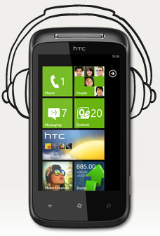
Windows Phone 7 is a complete departure from the Windows Mobile 6 of old, and a welcome one at that. Having turned on the handset and completed the initial setup, I was presented with the default Start screen as customised by HTC. A lot of fuss has been made by Microsoft about their new Start screen and Live Tiles. Each of the tiles that you can see up there in the above stock image are Live Tiles which update with information pertinent to the application, person or website that they’re associated with. For example, my mail tile will show the current number of unread messages in my Inbox. A Live Tile added for a person will show their photo, periodically display their name and latest Facebook update right there on your Start screen. Your Photos Hub tile will display a photo from your collection and other applications can display data like the current weather forecast, application updates awaiting approval or even your Xbox Live Avatar.
The Start screen also included a bunch of pinned applications including the HTC Hub and the Photo and Sound Enhancers. The HTC Hub is quite nice as long as you’re ok with sitting through an indulgent, albeit pretty, animated loading screen. After the load, you’re left with the clock and calendar widget that any user of an HTC Sense UI branded phone would find familiar, and the same list of suggested applications present in the Marketplace hub. Swiping to the right also provided a detailed weather application with animated weather effects designed to mimic the current weather in your location. I decided to drop the HTC Hub in favour of a lighter weather app as it simply took too long to display the important information.
One of the things that I love about this operating system (and the hardware requirements laid out by Microsoft) is that the experience is silky smooth. None of the jerky, laggy scrolling and swiping that we’ve become accustomed to on older smartphones. The clean lines and bold, open typefaces were the initial things that attracted me to WP7 and I’m happy to report that they’re part of the reason I’m staying. When it comes to choosing between the three major operating systems in this space (Android, IOS and WP7) you need to make your decision based on things extra to the core functionality of the products as they all essentially do the same stuff. They all make phone calls, they all send and receive SMS and they all have 3G internet connectivity. The first step of my decision was to dismiss Android. I like the concept, I like the openness of it and I absolutely believe that it should exist. It’s just that I wanted something less cluttered from my smartphone. I wanted an app marketplace that had some control around it so that I could be confident that a minimum level of quality was in place. This left me tossing up between the iPhone 4 and the HTC 7 Mozart.
On one hand, I had the iPhone 4. An absolutely known quantity – I knew that it was an awesome device and worthy of it’s current market share. A safe bet. On the other hand, the feature previews that I’d been reading from people who’s opinion I trust were throwing great praise WP7’s way. Enough to cause me to think long and hard about whether or not I was willing to risk becoming an early adopter of what could turn out to be another example of Microsoft’s apparent malaise regarding mobile technology. The panoramic design of the “Hubs” that have been shown off since early in the OS’ marketing cycle were one of the first things to intrigue me.

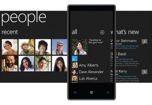
When navigating the phone’s primary functional areas, you are presented with these hubs – panels of content which are wider than the handset’s display. The last few pixels on the right of the display let you know that there is more content to be seen by giving you a tantalising glimpse of what is on offer, if only you would swipe your finger to view it. This impressively intuitive interface innovation removes the necessity for deep nested menus and allows the interface designers to present the same information and options in a much clearer fashion. It is interface decisions like these which solidified the decision to go with WP7 for me. The phone does all of the things that I need from a phone, while presenting them in a fresh and clean manner.
Adding contacts to the phone was a fantastically simple process. I inserted the SIM card from my previous phone and logged into my Windows Live, Google and Facebook accounts. The phone does a great job of automatically matching people with their many accounts. After 10 minutes of manually tidying up the few links that the phone wasn’t confident enough to work out on it’s own, I had a list of all of my friends and contacts each unified to single contact cards containing all of their relevant account information. Quick and simple. (Side note: Due to the difference in SIM size between Amy’s old phone and her new iPhone 4, she had to manually input all of her contacts)
Some quick in-built app notes: The messaging application is very similar to that on the other smartphones, using the conversational speech bubbles that you’re most likely already familiar with. The email application is simple, yet functional and fully compatible with Exchange, Gmail, Yahoo and Windows Live accounts. The new mobile version of Internet Explorer is absolutely functional and includes pleasant features such as the ability to concurrently load multiple tabs, Find On Page and integrated page sharing via SMS or email. It is snappy, non-mobile specific pages are viewable and are easily navigable. Flash is not supported, however. Copy and paste is still a “forthcoming feature”. The calendar app features push and happily syncs with your Google, Windows Live, Yahoo and/or Exchange accounts. The “Music & Video” hub is quite simply the same as the software that runs on any Zune device, with a few extra features. For instance, any videos watched on Youtube (via the Youtube app, thanks lack-of-Flash) will appear in your recent list of music, videos and podcasts on the Zune hub. Tapping one of these will return you to the video at the same point on the timeline that you left it.
All of this WP7 goodness is contained in a solid little handset that feels good in the hand and under the fingertips. The HTC 7 Mozart is a well built device with a removable battery, 8 megapixel camera and a Xenon flash. Power and cable-based synchronisation is delivered via an annoyingly obscure micro-usb port. The handset sports a user-replaceable battery, the cover for which manages to fit with the overall aesthetic of the phone. The touchscreen is accurate and responsive as proven by cross-hatch drawing tests. A pretty serious battery problem (which seems to be endemic to Telstra) has been plaguing me until recently which was causing serious frustration. The phone would require charging twice daily and would go flat overnight. After some furious (in both senses of the word) Googling, I came across a temporary workaround which has improved battery life dramatically. I now only need to charge the phone once over the course of a 48 hour period.
Xbox Live integration will obviously only interest those with an Xbox Live account, and a device with which to endow it with cheevos. The application allows you to send and receive messages from your Xbox Live friends, view your list of games and achievements, compare achievements with friends and make changes to your Avatar(!). It also comes in very handy when I run into Bice in meatspace and want to remind him of my ever-growing lead.
All in all, I am very happy with the device. There are a few quirks that should be ironed out as time passes. Considering their track record in this market and the fact that this is the first revision of the operating system, Microsoft have succeeded to produce a viable contender in the smartphone market. An achievement that should be celebrated in the traditional fashion.
